If you’re not entirely sure what a rebrand is, I suggest you take a look at Lia’s article, but I thought I would explain why we chose to go through this challenging and time-consuming process. If I were to start the business from today I would never have chosen the name Strategy Plus. It doesn’t flow off the tongue when chatting over the phone or telling people the domain name.
Where did the name come from?
The name was chosen by my Father back in the 90’s. Purely as a marketing consultancy at the time and it was all about producing positive strategies for the clients, hence the name. The logo was pretty simple, symbolising a positive graph and reflected the name.
This may have made sense in the 90’s but over the years we’ve certainly changed what we do and the way in which we do it. This doesn’t mean you just scrap a trusted brand for some trendy new name and logo, not only will this confuse existing loyal clients but also make it hard for those looking to find us via word of mouth.
What’s in a name?
I’m sure people can think of a name too much. I can think of plenty of brand names out there that don’t have any meaning or that don’t roll off the tongue.
These are some extreme examples of famous brands realising their names just had to change:
1. Quantum Computer Services » AOL
2. BackRub » Google
5. Research in Motion » Blackberry
6. Brad’s Drink » Pepsi-Cola
7. Tokyo Tsushin Kogyo » Sony
8. Starbucks Coffee, Tea and Spice, Il Giornale Coffee Company » Starbucks
9. Blue Ribbon Sports » Nike
11. AuctionWeb » eBay
12. Computing Tabulating Recording Corporation » IBM
13. Marafuku Company, Nintendo Playing Card Company » Nintendo
14. Pete’s Super Submarines » SUBWAY
15. Confinity » PayPal
16. Jerry’s Guide to the World Wide Web » Yahoo
You can see a trend of businesses changing their name to be less descriptive to more simple, a name that can be easily said, spelt, branded etc
Strategy Plus
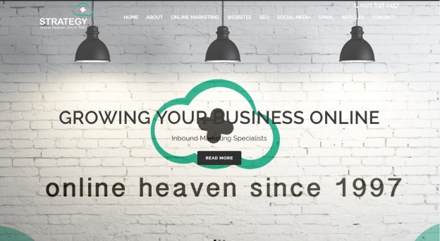
As you may have noticed our brand hasn’t changed that much, we still have a green colour scheme and are trying to slowly remove the Plus from our name, from Strategy Plus to Strategy+.


The reason being is that we are looking for continuity, we have a comparatively long history in our industry and a lot of experience. If we were to change everything, I feel as though we would risk our most important USP. The aim of the rebrand was to simplify the name, logo and have it better reflect what we did and our companies slogan. We have to practise what we preach and ensure all aspects of our brand portrays the image you strive so hard to achieve.
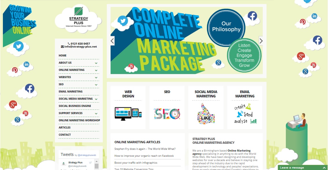
Once you have an idea on the logo you have to start implementing onto all your marketing material, starting with our most important tool, the website. I was always proud of our carton style website as it was genuinely different from anybody else in our industry. We wanted to show that this subject matter doesn’t have to be pretentious or complicated and therefore the cartoon effect hopefully made us more approachable to SME’s.

However, times have changed and our SME customers are no longer wary of agencies and are far more clued up on the subject matter. This means we now have to change the feel from friendly to an experienced specialised agency.

Performance
It is hard to calculate the number of times your branding is seen by others and the value it has. This process has taken over 7 months for us but we ensured it was done in a way that integrated seamlessly throughout all our marketing material and won’t be changed again for another decade (I hope).
We have now analysed the new website’s performance since going live. Since then all the KPI’s for user experience are all improving:

We hope you like it!
Take a look at our Graphic Design page if you’re ever thinking of a refresh of your own brand.


